
Your website gets traffic. Thousands of visitors per month. But your conversion rate sits between 1-2%, and every attempt to improve it feels like guessing. You have tried new hero images, different button colors, and a popup that annoys everyone. Nothing moves the needle.
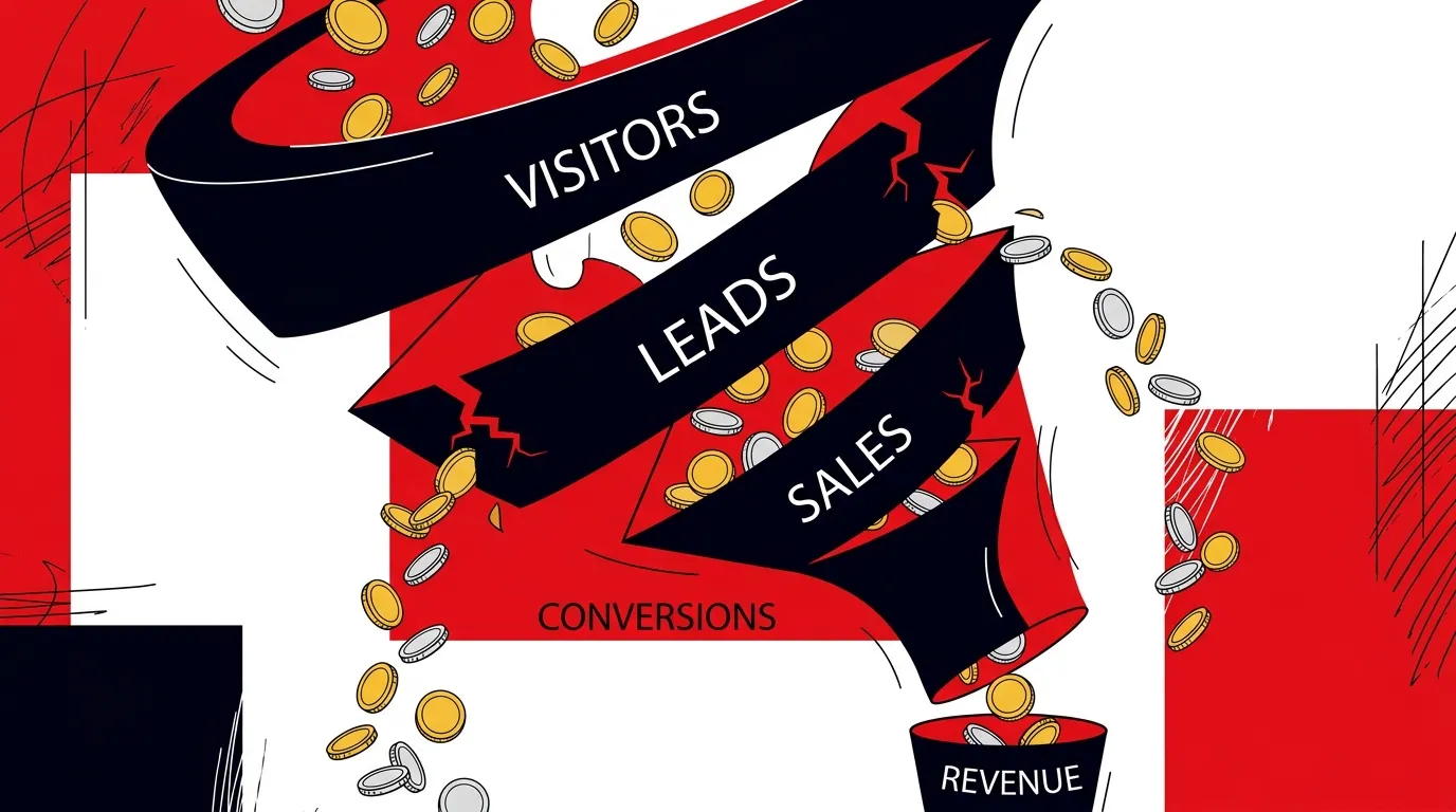
The problem is almost never one thing. It is a collection of design mistakes that individually seem minor but together create an experience that leaks conversions at every stage. A high-converting website design does not come from getting one element right. It comes from eliminating the dozens of small friction points that silently push visitors away.
We have audited hundreds of lead generation websites. These are the mistakes we find most often.
Mistake 1: No clear visual hierarchy on key pages
When everything is emphasized, nothing is. This is the single most common design failure we see on service business websites.
Symptoms:
- Multiple competing headlines or callouts on the same page
- Every section uses the same visual weight and layout
- The primary CTA is visually indistinguishable from secondary actions
- Users have to scroll and search to figure out what to do
High-converting website design establishes a clear visual path: primary headline, supporting context, social proof, and a CTA that stands out from everything else on the page. Each element has a defined role in the conversion sequence.
Mistake 2: Treating the homepage like a brochure
Most business websites treat the homepage as a comprehensive overview of everything the company does. Services, team bios, company history, client logos, blog posts, testimonials, all on one page.
The result is a page that tries to serve everyone and converts no one. Visitors with specific needs cannot find the relevant information quickly. The page is too long, too unfocused, and too generic.
What works better:
| Brochure Approach | Conversion-Focused Approach |
|---|---|
| Lists every service equally | Highlights the most requested services |
| Company history section | Customer outcome stories |
| Generic "We serve all industries" | Specific industry callouts with dedicated paths |
| One contact form at the bottom | Multiple CTAs matched to different intents |
| Team photos and bios | Proof of results and expertise |
Your homepage is not a brochure. It is a routing system. Its job is to identify what the visitor needs and get them to the right page as fast as possible.
Mistake 3: Slow page load speed
This one is measurable and the data is clear. Google research shows that as page load time increases from 1 to 3 seconds, bounce rate increases by 32%. From 1 to 5 seconds, it increases by 90%.
Common speed killers on lead generation websites:
- Unoptimized images: Hero images at 3MB+ when 200KB would be visually identical
- Heavy third-party scripts: Chat widgets, analytics tools, and tracking pixels stacking up
- No lazy loading: Every image and video loads on initial page load
- Bloated CSS and JavaScript: Template themes carrying unused code
- No CDN: Serving all assets from a single server location
Website design for lead generation must treat speed as a core design requirement, not an afterthought. Every design decision should be evaluated against its performance cost.
Mistake 4: Mobile as an afterthought
Over 60% of web traffic is mobile for most service businesses. Yet the desktop version of the site gets all the design attention, and the mobile experience is whatever the responsive framework produces.
Mobile-specific mistakes that kill conversion:
- Tap targets too small: Buttons and links that are hard to hit with a thumb
- Forms that are painful on mobile: Too many fields, no autofill support, tiny input areas
- Fixed elements blocking content: Sticky headers, chat widgets, and cookie banners consuming half the screen
- Horizontal scrolling: Layout elements that break on smaller screens
- CTA below the fold: The primary action requires scrolling past multiple sections
A high-converting website design is designed mobile-first. The mobile experience should be the primary design, with the desktop version expanding on it. Not the other way around.
Mistake 5: Not understanding landing page vs website design
This mistake is strategic, not tactical. Many businesses send paid traffic to their main website pages instead of dedicated landing pages. The conversion rate difference is substantial.
Understanding landing page vs website design is critical:
- Website pages have navigation, multiple CTAs, and serve organic visitors exploring your brand. Conversion rates typically range from 1-3%.
- Landing pages remove navigation, focus on one offer, and match the specific intent of the traffic source. Conversion rates typically range from 5-15%.
If you are running paid campaigns and sending traffic to your homepage or general service pages, you are likely leaving 3-5x conversion improvement on the table.
The design requirements differ too. Landing pages need a stronger visual hierarchy, more aggressive CTAs, tighter messaging alignment with the ad, and no exit paths (no navigation, no footer links, no distractions).
Mistake 6: Forms that ask too much
Every additional form field reduces your conversion rate. This is one of the most well-documented findings in conversion optimization. Yet we still see lead generation forms asking for company size, budget range, project timeline, and a detailed description of needs before someone can request a simple callback.
What we recommend:
- Above-the-fold forms on landing pages with 3-5 fields maximum
- Name, phone, email as the starting point. Everything else can come from the sales conversation.
- Clear privacy signals next to the form (no spam promise, privacy policy link)
- Specific submit button text ("Get My Free Quote" not "Submit")
The information your sales team wants is not the same as the information you should ask for upfront. Get the lead first. Qualify later.
Frequently asked questions
How do we know which design changes will have the biggest conversion impact?
Start with data. Install heatmapping and session recording tools. Watch how real visitors interact with your key pages. The biggest conversion opportunities are almost always visible in the data: sections nobody scrolls to, CTAs nobody clicks, forms where users drop off midway.
Should we redesign our whole website or optimize the current one?
Optimize first unless your current site is technically broken. A full redesign takes months and carries risk. Targeted improvements to your top 5 traffic pages can deliver measurable conversion gains within weeks. Save the redesign for when you have enough data to know exactly what the new site should look like.
How often should we update our website design?
Core structure and design system updates should happen annually. But conversion optimization should be continuous. Run A/B tests on key pages monthly. Update content quarterly. Treat your website as a living system, not a finished project.
What is a good conversion rate for a lead generation website?
For service businesses, 3-5% is solid for organic traffic. Dedicated landing pages for paid traffic should target 8-15%. If you are below these benchmarks, there are likely design and UX issues worth addressing. The specific number varies by industry and offer, but these ranges are a useful starting point.
Stop leaking leads
Your website is either converting traffic into pipeline or losing it. There is no neutral. Every design decision either reduces friction or adds it. Every page either builds trust or undermines it.
Talk to a Website & UX Strategist about auditing your website for the conversion gaps that are costing you booked jobs.
References
- Google, "Think With Google: Mobile Page Speed Benchmarks"
- HubSpot, "The State of Landing Pages"
- Baymard Institute, "Form Usability Research"