
Your customer portal looks professional. Your booking flow was designed by a competent team. But completion rates are underwhelming, support tickets about basic tasks keep stacking up, and the conversion rate on your quote request form has not improved in months.
Product design mistakes rarely look like obvious failures. They look like forms that are a little too long, flows that take one too many steps, and interfaces that almost make sense but not quite. These small friction points compound across your entire user base, silently dragging down the metrics that matter.
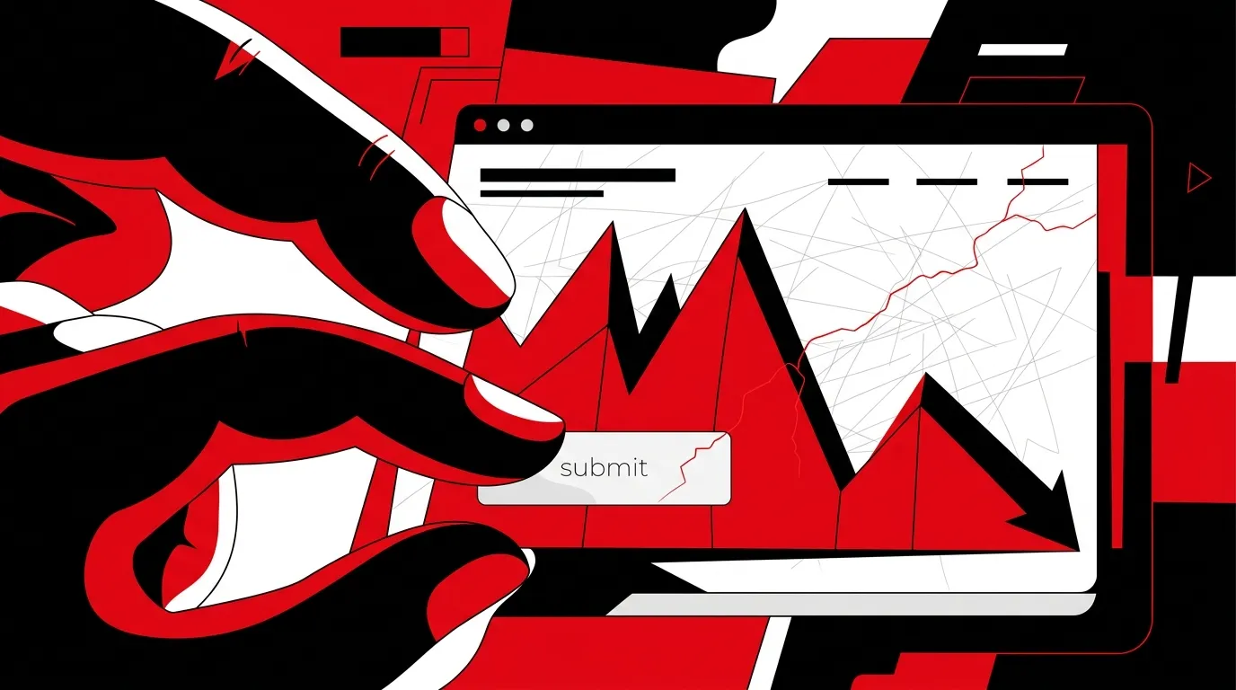
UX for lead generation gets treated as an afterthought at most companies. They invest in driving traffic and then funnel it through product experiences riddled with unnecessary friction. Here are the mistakes costing you the most.
Mistake 1: Optimizing for first-time use instead of repeat use
Most product design focuses on the initial experience. The onboarding flow gets polished. The first-run tutorial is smooth. But the tasks users do every day? Those get neglected.
For lead generation products (portals, booking tools, customer dashboards), repeat-use flows drive the bulk of your revenue. A contractor who logs in daily to manage leads needs a different experience than someone seeing the product for the first time.
What this costs you:
- Power users find workarounds that bypass your designed flows
- Time-to-task increases as users learn to navigate around friction
- Feature adoption plateaus because new features are buried behind unintuitive navigation
The fix is to study your high-frequency users. What do they do most often? Make those tasks the fastest possible.
Mistake 2: Too many steps in critical conversion flows
Every step in a flow is a drop-off point. This is not theory. It is math. If each step retains 85% of users, a 5-step flow converts just 44% of people who start it. A 3-step flow converts 61%.
| Flow Length | Step Retention | Completion Rate |
|---|---|---|
| 3 steps | 85% per step | 61% |
| 5 steps | 85% per step | 44% |
| 7 steps | 85% per step | 32% |
| 10 steps | 85% per step | 20% |
We audit conversion flows constantly, and the single highest-impact change is almost always reducing step count. Most multi-step forms can be condensed. Conditional logic can eliminate irrelevant fields. Progress indicators can reduce perceived complexity.
UX for lead generation should be obsessively focused on removing steps from every flow that ends in a conversion event. Quote requests, contact forms, booking flows, account signups. All of them.
Mistake 3: Confusing product design with website design
The distinction between product design vs website design matters more than most teams realize. They are different disciplines with different success metrics.
Website design is about communication and persuasion. The user reads, evaluates, and decides to take action. Product design is about task completion. The user has already decided. They are trying to accomplish something.
Applying website design thinking to product design creates these problems:
- Marketing-style layouts in functional interfaces (large images and whitespace where users need density)
- Persuasive copy where instructional copy is needed (tell users what to do, not why your feature is great)
- Visual flair that slows down task completion (animations and transitions that look impressive but add friction)
Product interfaces should be fast, clear, and predictable. Save the persuasion for the marketing site.
Mistake 4: Ignoring error states and edge cases
The happy path looks great in every design review. But real users encounter errors, empty states, timeouts, and validation failures constantly. How your product handles these moments is often the difference between a completed conversion and an abandoned session.
Common edge cases that get skipped:
- Form validation errors: Red text that says "Invalid input" instead of explaining what the user needs to fix
- Empty states: Blank screens with no guidance when a user has not yet created any data
- Loading states: Spinners with no context. Users do not know if the system is working or frozen.
- Session timeouts: Users lose their progress in a multi-step form because the session expired silently
- Mobile keyboard interactions: Form fields that get hidden behind the on-screen keyboard
A solid product design strategy accounts for every state a user can encounter, not just the ideal one.
Mistake 5: Designing without data
Product design decisions should be grounded in user behavior data, not team opinions. Yet most teams design based on internal consensus, stakeholder preferences, or competitor imitation.
The data that should drive your design decisions:
- Heatmaps and session recordings: Where do users actually click, scroll, and hesitate?
- Funnel analytics: Where exactly are users dropping off in your conversion flows?
- Support ticket analysis: What tasks generate the most confusion?
- A/B test results: What design changes actually move conversion metrics?
- Task completion time: How long does it take users to finish key actions?
Designing without this data is guessing. And guessing is expensive when every percentage point of conversion rate directly impacts revenue.
How to prioritize product design fixes
Not every UX problem is worth fixing right now. Use this framework to prioritize:
- High traffic + low completion rate: Your most-visited conversion flows with the worst completion rates. Fix these first. The impact is immediate.
- High support ticket volume: Flows that generate the most confusion. Fixing these reduces support costs and improves user satisfaction.
- Revenue-critical flows: Any flow that directly results in a booked job, a purchase, or a lead submission. These get priority regardless of traffic volume.
- Everything else: Important but not urgent. Schedule these for your regular design iteration cycle.
Frequently asked questions
How do we measure the ROI of product design improvements?
Track conversion rates on specific flows before and after changes. Compare task completion time, form abandonment rate, and support ticket volume. These metrics translate directly to revenue when tied to lead generation or booking flows. Even a 5% improvement in quote form completion can mean significant monthly pipeline gains.
Should we redesign our entire product or fix individual flows?
Fix individual flows first, starting with the highest-impact ones. Full redesigns are expensive, disruptive, and risky. Incremental improvements to critical flows deliver faster ROI and lower risk. Save the full redesign for when incremental fixes have addressed the biggest issues and a systematic overhaul is justified.
How is UX for lead generation different from UX for SaaS products?
UX for lead generation focuses on getting the user to a conversion event as quickly as possible. The user journey is shorter and more directed. SaaS UX focuses on long-term engagement, retention, and feature adoption. The design priorities differ. Lead generation UX optimizes for speed and clarity. SaaS UX optimizes for depth and discoverability.
How often should we test product design changes?
Continuously. Every significant design change should be A/B tested before full rollout. Smaller teams can batch design changes into bi-weekly or monthly release cycles and test the aggregate impact. The key is never deploying design changes without a plan to measure their effect.
Fix the friction before you scale the traffic
Driving more traffic into a product experience with UX problems just multiplies the wasted opportunity. Before your next campaign push, audit the conversion flows your traffic actually uses. Find the friction. Remove it. Then scale.
Talk to a Product & UX Strategist about identifying and fixing the UX gaps that are quietly costing you pipeline.
References
- Nielsen Norman Group, "Usability Heuristics for User Interface Design"
- Google, "Mobile UX Best Practices"
- Baymard Institute, "Cart Abandonment Rate Statistics"